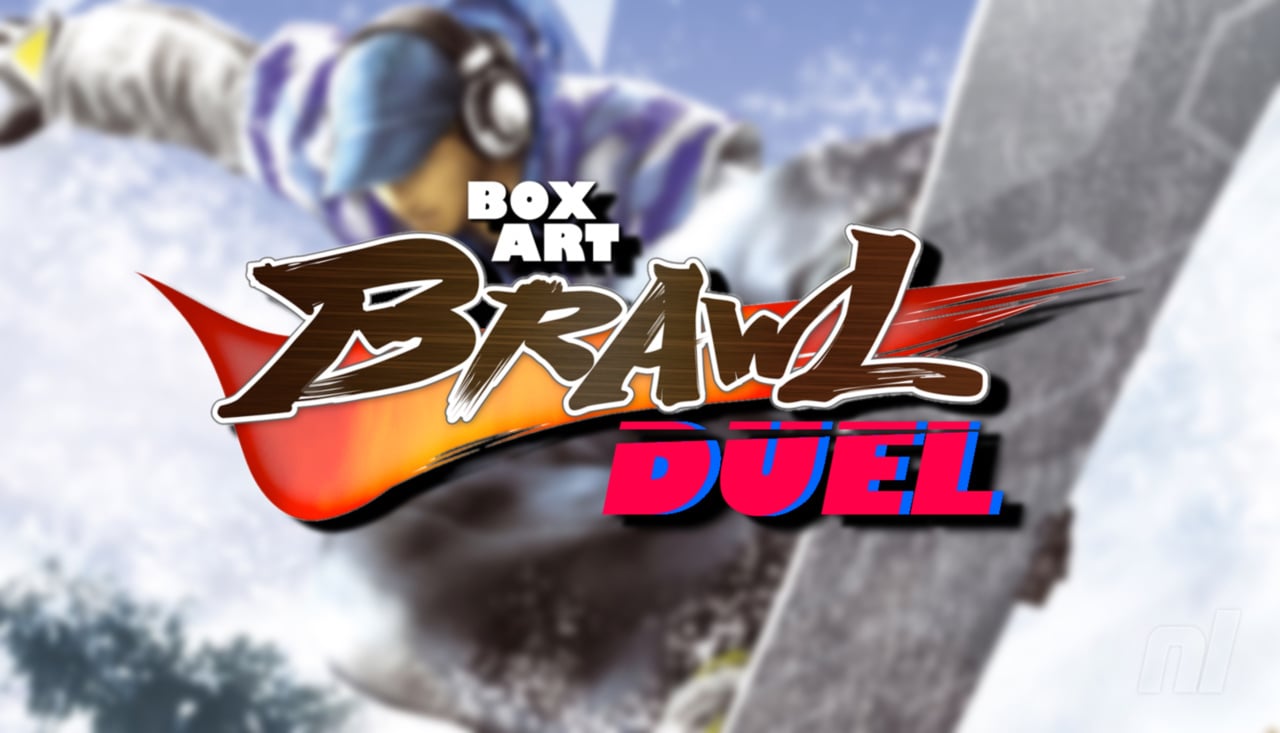
Be sure to cast your votes in the poll below; but first, let’s check out the box art designs themselves.
North America / Europe
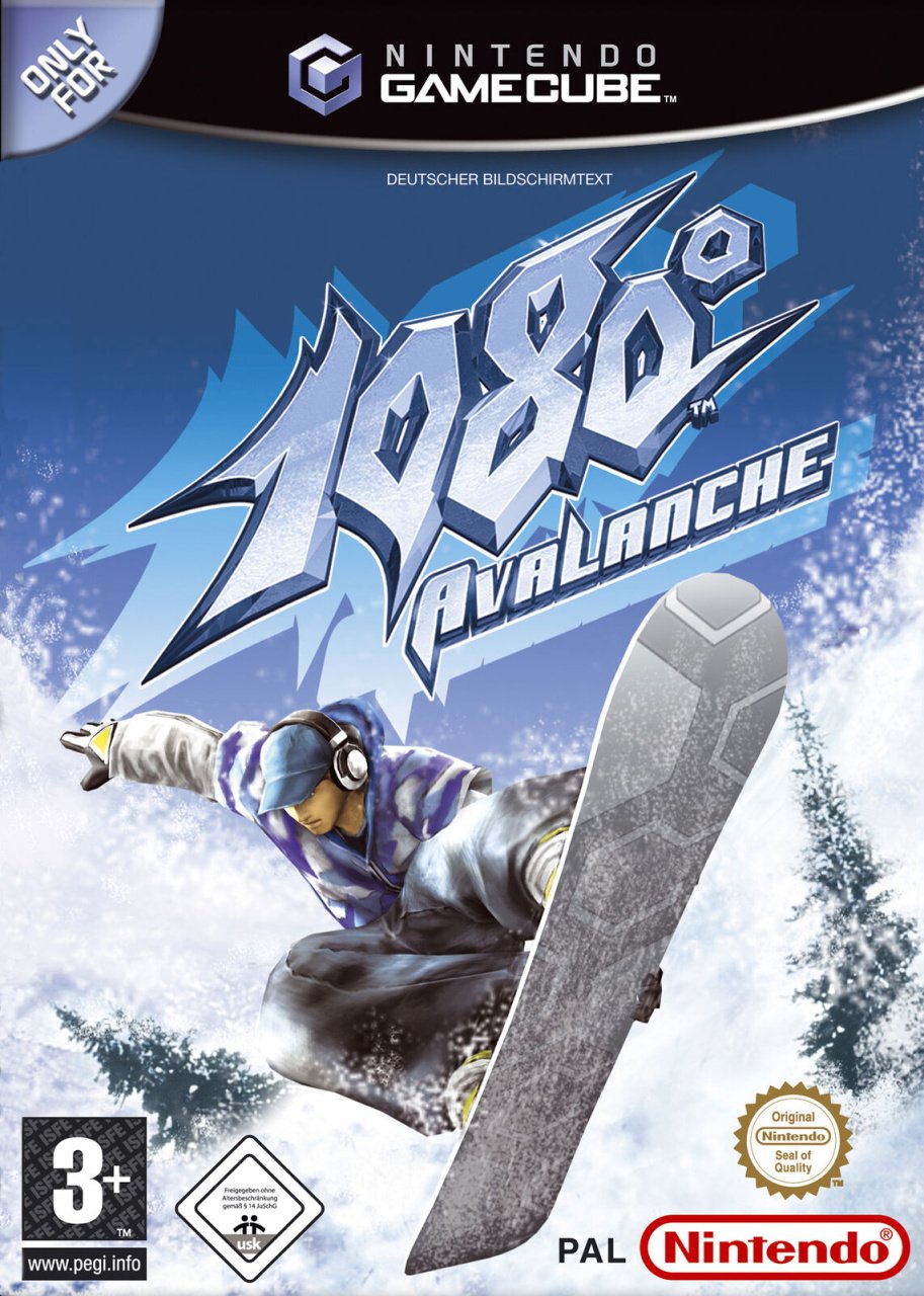
The western design is very much your quintessential extreme sports composition, showcasing a snowboarder pulling off a sick trick in the foreground, with the game’s stylised logo sitting just above. It’s an impactful piece, and would certainly stand out amongst the crowd on store shelves.
Japan
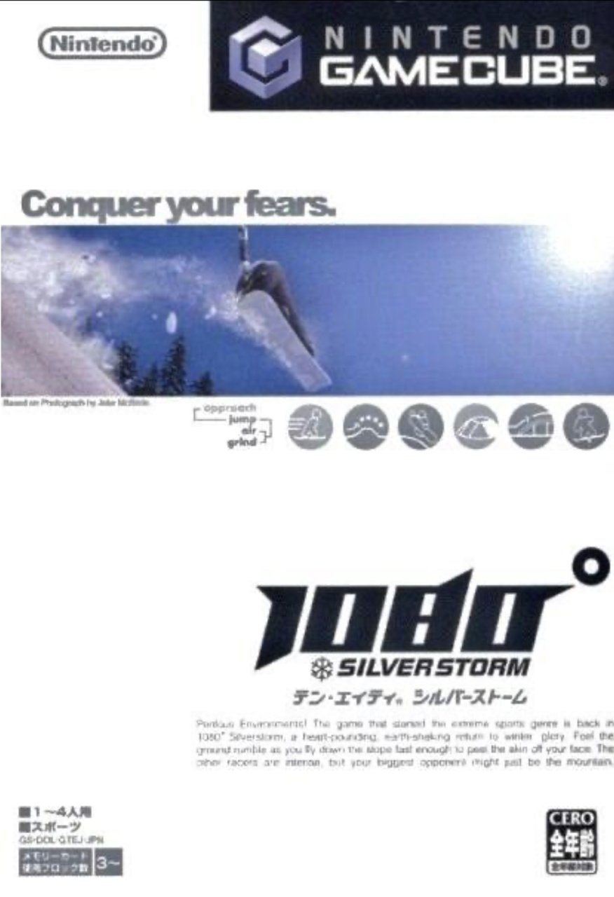
We’re not sure if it’s just us, but we kinda love the weirdly clinical design here. It’s very clean and sophisticated, and the little compact image of the snowboarder running across the upper half of the box is very cool.
One side note: it was very difficult to locate a good, high-res image of this box art, so some of the text might be illegible. The main text reads:
“Perilous Environments! The game that started the extreme sports genre is back in 1080° Silverstorm, a heart-pounding, earth-shaking return to winter glory. Feel the ground rumble as you fly down the slope fast enough to peel the skin off your face. The other racers are intense, but your biggest opponent might just be the mountain.”
Gnarly.


Thanks for voting! We’ll see you next time for another round of Box Art Brawl.
Trending Products


Amiibo – Sephiroth – Super Smash Bros. Series